The Adventures of Tintin
seen @ Jamaica Multiplex Cinemas, Jamaica, Queens NY
1.10.12
In his seminal book about the history and unique nature of the medium, Understanding Comics, Scott McCloud posited that the appeal of Tintin creator Herge's art style lay not just in his "ligna claire" style - the ease and grace of his linework - but also the fact that the character is a simply-rendered image against a meticulously-rendered background. McCloud states that the simpler a character is drawn, the more universal its appeal, since the lack of specificity makes it easier for one to project themselves into the character.
As a visual artist, I can attest to this. In college, I learned the value of juxtaposing simple, less-detailed areas against heavily-detailed ones. When I started making comics, however, my inclination was to draw like most superhero artists, since I was under the mistaken belief that this was how one becomes a success in the industry. It wasn't until I changed my style to one closer in spirit to Herge's that I began to get noticed (not that I ever became a star or anything).
In North America, comics fans generally tend to prefer detail to a ridiculous degree, particularly in their superhero comics: every last vein and muscle on the bodies; elaborate costumes and weaponry; cityscapes in which you can see every window in every building. One popular artist pays so much attention to detail that he actually broke his wrist while drawing a highly-anticipated crossover mini-series featuring characters from Marvel and DC Comics. While such devotion is commendable, I was taught that in art, detail for detail's sake is less important than being judicious with it - knowing how to use it and where. Herge embodies this philosophy, which may be one reason why Tintin, as well as Carl Barks' Donald Duck comics, have historically been more popular in Europe.
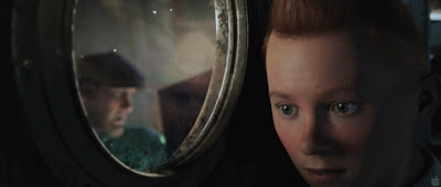
Steven Spielberg and Peter Jackson have said that they chose to make The Adventures of Tintin in computer-generated performance capture (I'll leave it to you to decide whether or not it should be called animation), in part, to pay tribute to Herge's distinctive style. The film is a marvelous hybrid of Herge's character designs with the photorealism capable with CGI. Tintin looks more or less like a real teenager, even with his distinctive duck-tail hairdo, but secondary characters like Haddock and Thomson & Thompson maintain their more distinctive features. And of course, with p-cap, their movements seem more fluid and natural.
I forewent seeing Tintin in 3D, though I'll bet it looks great that way. Still, I was quite taken with this film. The non-stop action has the feel of Spielberg's Indiana Jones movies. I confess, I've read very little Tintin myself, so perhaps the books answer a few nagging questions I had - for instance, if he's a reporter, why do we never see his office, or at least his editor (if he's only a freelancer)? Doesn't matter though.


No comments:
Post a Comment
Note: Only a member of this blog may post a comment.